Pico Image Carousel
This web component provides a carousel for showing multiple images in a carousel style, supposed to work on desktop and mobile.
In Action
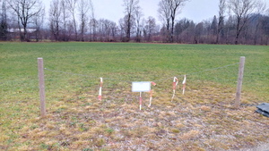
The "widget" you see below, is a web component, using Shadow DOM and ES Modules. To use it, adapt this code:
<script type="module" src="https://corsproxy.io/?https%3A%2F%2Fwolframkriesing.codeberg.page%2Fpico-elements%2Fpico-image-carousel.js"></script>

<pico-image-carousel>
  <img src="image1.avif">
  <img src="image2.jpg">
  <img src="image3.webp">
</pico-image-carousel>




Features
The <pico-image-carousel> component takes a set of <img>
tags and renders them aside one another, showing a so-called carousel.
As is the nature of a web component, it contains all the styling and logic inside the component,
so using it and making a set of images visible, as you see below, is just a matter of surrounding
the images with the HTML tag pico-image-carousel and importing the according
JavaScript file.
No matter the frontend library or framework used on your site (svelte, vuejs, lit, ...)
you can use this web component as is on your site too, just like you use any other HTML tag.
The component uses
scroll-snap, a CSS feature
to ensure the left side of the carousel box always aligns to the start of an image.
Just try it out by sliding through the images and trying to stop sliding when only half of an image
is visible. It will snap to the left edge of the image. Especially on mobile this makes such a
carousel feel much nicer.
Use <picture> tag
Below you see how to use the component with the <picture> tag.
Just view the code.
Since the <picture> tag is the first level child of the
<pico-image-carousel> tag we must use additional CSS to style the
<img> tag to be of the size which we want it to be.
We do not have to do that when the <img> is the first child, since
the web component does that by default.


Use <figure> tag
A bit more complex content can also be the <figure> tag used inside. This requires a bit more of explicit styling for it, see the source code for how to do that.
